Automate — extract from Agreenculture's solutions video © Agreenculture

In 2019, when I arrive at Agreenculture, the company is three years old. Robots are in development. In order to launch the mission, the process is very cumbersome and unsafe, what is totally normal at this stage in a Research & Development context.
As the aim is to promote this application to a public whose activity is centered on agriculture, it goes without saying that the interfaces will have to evolve.
User Experience and Interface Design
But the task is not easy, there is no real end user yet, the market doesn't even exist, and product ecosystem is not enough mature to create focus groups.
Some designers told me to test the application at a mockup stage, here was my answer :
- what is the value of the user's feedback, if the latter presses a button that does not trigger any action on the robot ?
- what do we test, the color of the button or a functional ecosystem ?
Robotics is one of those fields that requires a certain level of technical maturity for user tests to be of any value. One day, it will be possible to carry out simulation tests, as users will have reached a sufficiently familiar stage with the system, to be able to project themselves with a degree of abstraction, comparable to the aeronautics or automotive industries.
Clément Ader and the Wright brothers needed a complete airplane before testing it.
Initial context

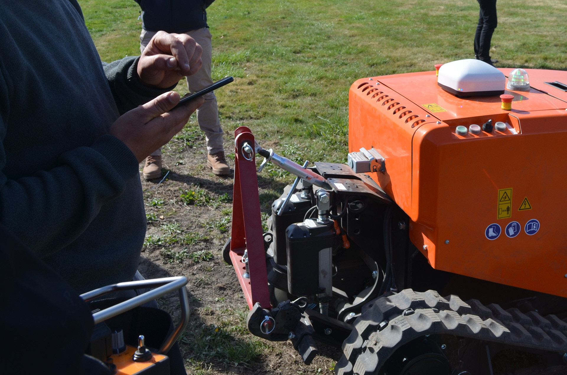
CEOL's buttons panel

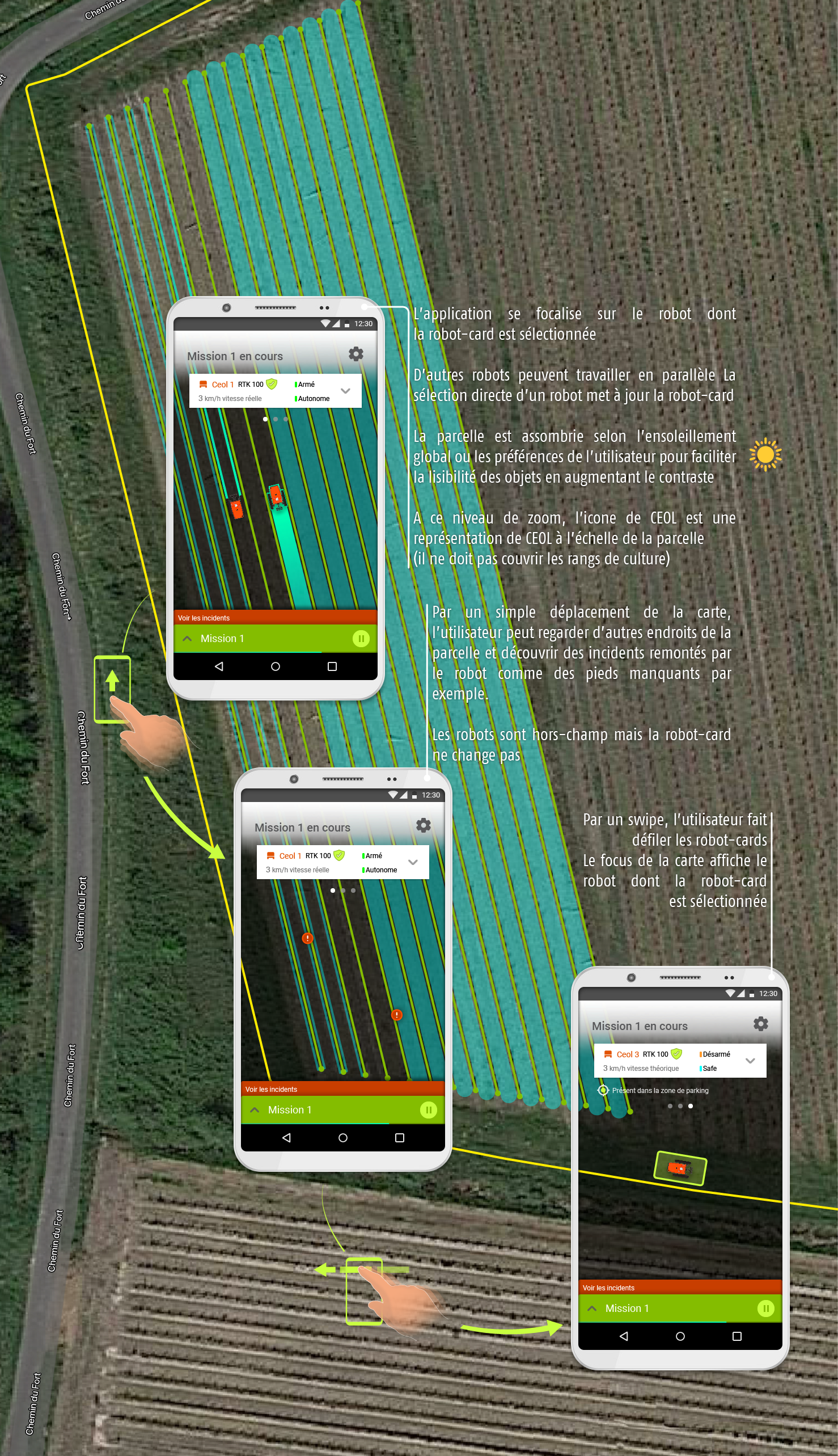
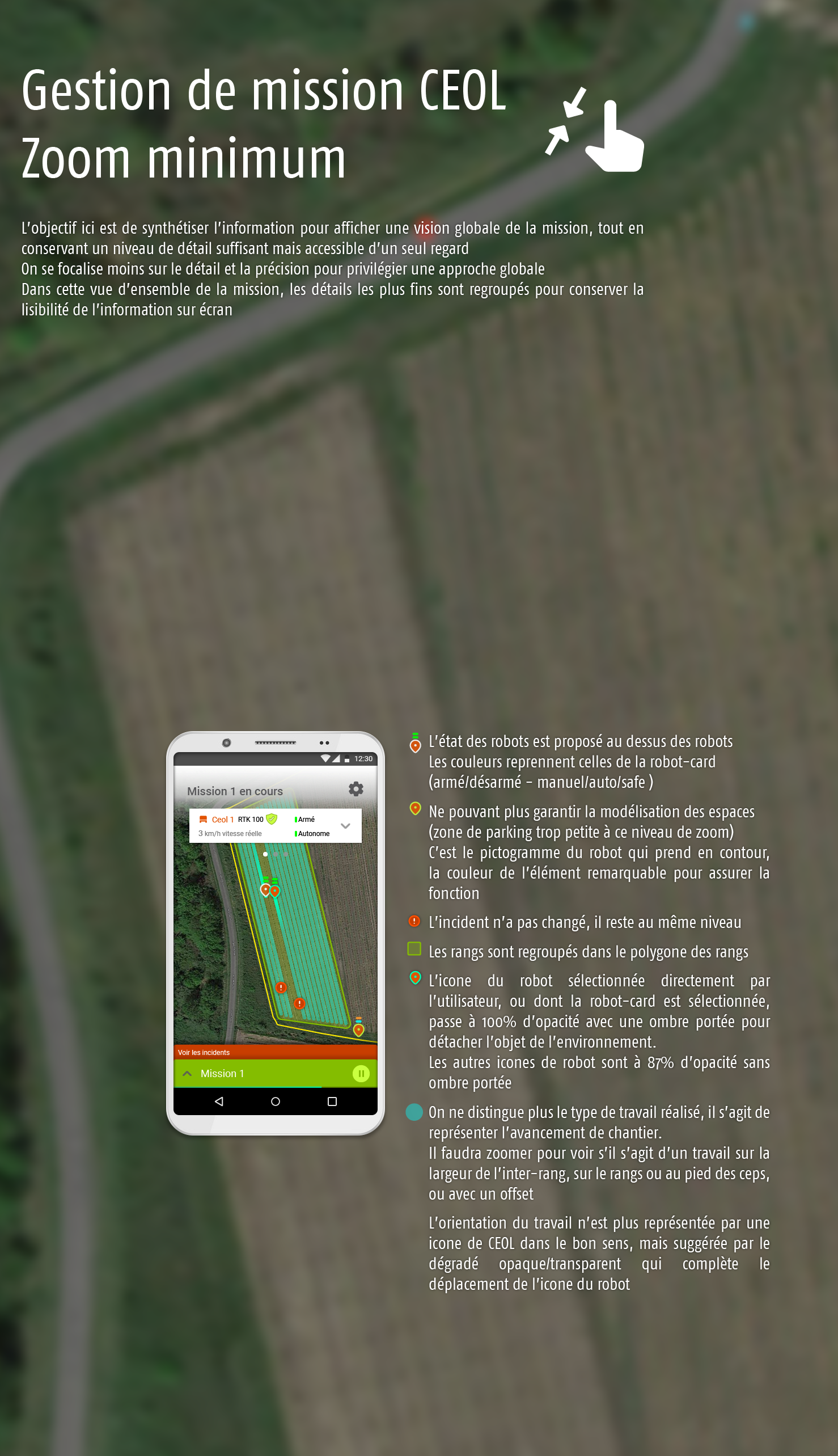
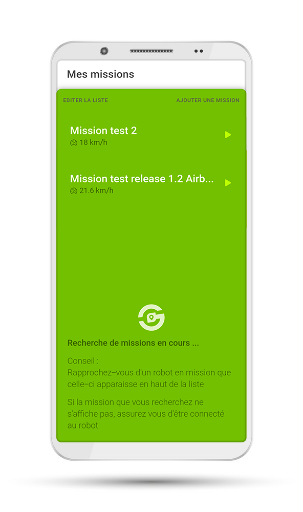
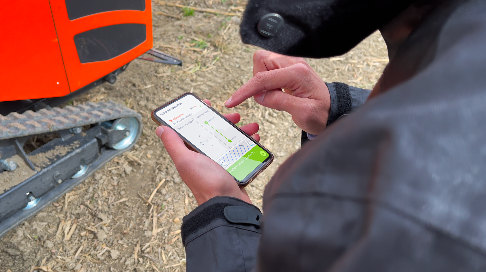
CEOL's Monitoring Application

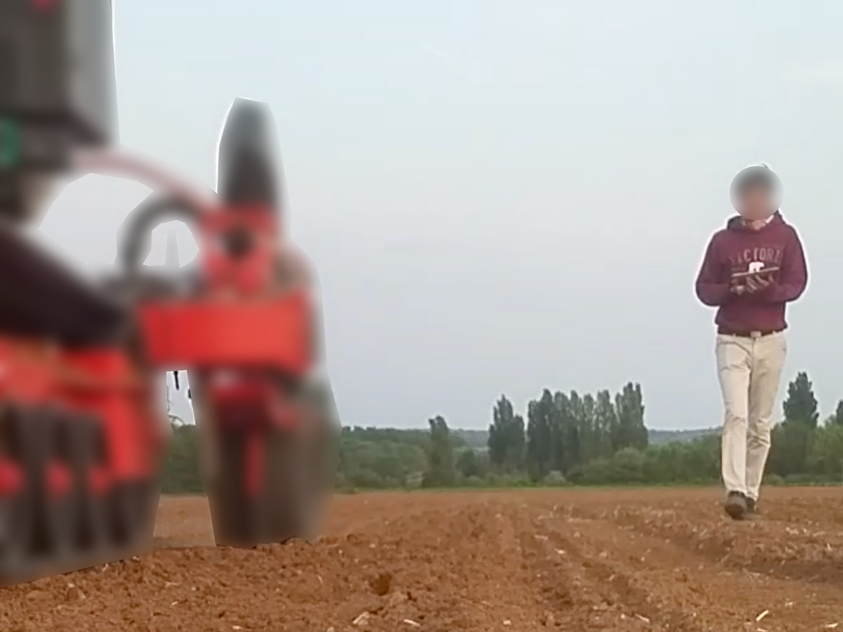
operator running after the robot
operator holds the tablet with both hands
tablet after passing under the tractor tracks
Two levels of intervention
- The operator has his hands full, and must manage three channels of interaction on-board (button panel) and remote (tablet application, then a remote control), but he only has two hands and can't be in two places at once.
- The tablet's screen is cluttered, combining functions without a path, navigation is complicated, and elements have been added over time. The HMI does not take into account the context of use (sunshine, rain, use of gloves, storage, etc.) and offers features that are too difficult to master, such as joysticks.
Paradigm & Analogies
After this audit, I introduce the notion of HMI paradigm to the engineering team which is also my first pool of users. I simply introduce the fact that users are first and foremost living beings, and their experience does not end with the products we make.
They have a past and a future, in which other products exist. So our products are designed to fit into a pre-existing eco-system.
If we want our products to be adopted, the first best practice is to take this context into account, as it is already codified and offers solutions for problems similar to those we wish to tackle.
We validate together that :
- Monitoring missions or machines should be as easy as getting weather informations, on different locations in real time, as it is comparable to the weather of the system (mission / robot)
- Launching a robot in a mission, should be as easy as starting a trip on my GPS. Instead of me driving, AGCbox is in charge, but still, the machine will manage traffic and we want to know the ETA (Estimation Time of Arrival)
I start to organize features with these standards in mind.

(left) iOS weather app © Apple - (right) Launching trip to get ETA and navigation instructions with Waze ©Waze

Both of these applications use a layer or panel system to manage information granularity.
The wider the panels or the closer they are to the ground, the more detailed is the information.
💡 This is a spatiotemporal paradigm : the way design manages to bring the right information at the right time and the right place to the right user, based on its need at that moment. In other words, when you zoom in on a map we can propose different features than when you zoom out, because statistically you are expecting more precision.
Weather app : multi missions / robots dashboard, instant awareness of the global situation of my organization, detailed feedbacks on one specific item, rapid changeover between two states
GPS app : access to all my data and playable or planned missions, get located and in real time feedbacks, can send instructions, share alerts or informations
Backbone of the application
The application uses three dimensions to govern behavior and distribute information.
Ambition
Robotization is intended to serve needs and answer users issues, like any other object human made.
What is different - and exciting as a Designer - with robots, is that they are developed in a way that, from a user's perspective, they have more abilities than conventional tools. CEOL is autonomous in the field, you don't guide it through a remote controller during its mission. It is also able to interact with humans at a very high level.
The design job is to keep the complexity behind the scene and organize tools (user actions) and informations (system feedbacks) to happen at the right moment and the right time.
The Designer build the relation between human and machine so the final user is surprised to discover how easy and natural it is to exchange with the robot, without ever imagining all the technology needed.
Development
After the audit phase we organized features in a mind map to build the global vision before creating a backlog. It is an iterative process
🔁 Features > Mockups > Deliverables > Implementation > Test and validation
This project is still under development.

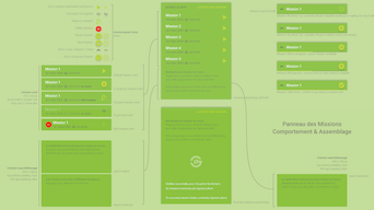
Mind-mapping is easy to setup and maintain in industrial conditions, where time matters.

After several iterations it becomes a synthesis of all the user stories

Comprehensive screenflow of the application reflects a synthesis of all the user journeys available in the application. We detach specific sequences to development purposes

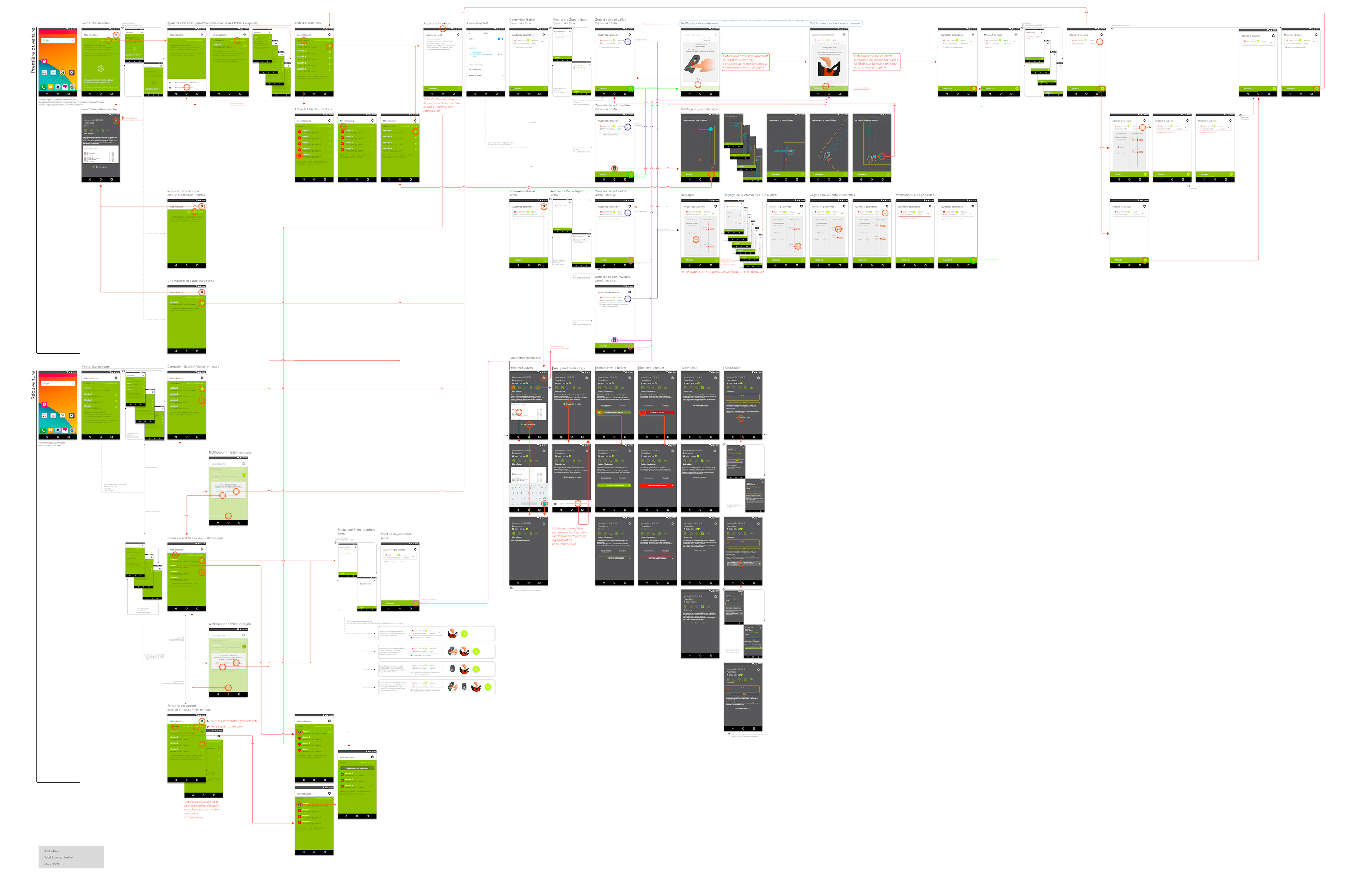
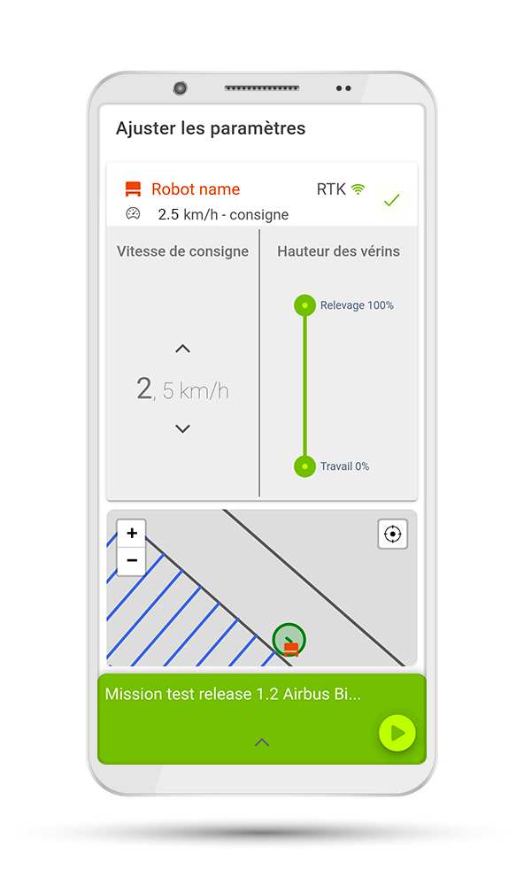
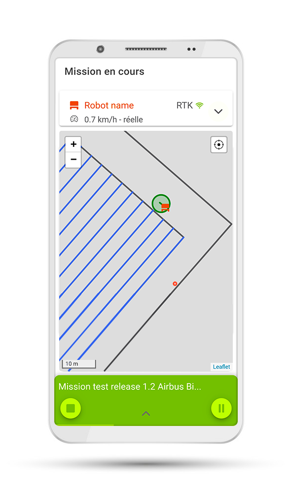
complete screen flow of CEOL's mission management application

Automate has become complex and other projects started in the meantime, we moved from product components to a Design System
To better share the vision we also use animation so the specifications are fully covered
Design System / Wireframes / Motion Design / Screenflows

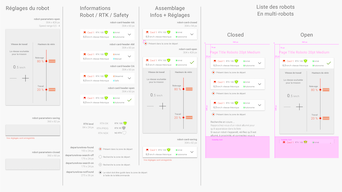
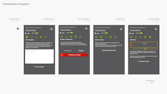
Example of animated design mockup with a very early version of the app

Implicit User Experience
Not all of the UX (User eXperience) is on the screen. The interaction is global with the system behind CEOL. The best design is the one you don't see. Before I present screens, I must be grateful to the developers who make the magic happens with the robot.
The fact that user don't have to think about some details means a lot of work for technical teams. For example, one of my favorite feature is the fact that the robot can start its mission from almost anywhere in the field. Otherwise, the cognitive load every day would be huge. Think for a second about the difference it would be to have to remember the exact row in front of which you have to place your robot before launching the mission.
These details make a huge difference in the quality of the global experience with the product and the brand.
Never get stuck
Observing how engineers avoid the pitfalls of an imperfect system during this period, teaches me a lot about how the application will also have to help users by offering them safeguards.
Users have to manage three channels of interaction in order to launch the mission. These actions must be done in specific order, and most of the hotline calls concern these oversights.
However, launching a robot on a mission remains a complex task requiring several steps that will not be compressed for some time to come.
The aim of design is therefore to manage complexity, in order to streamline the process and avoid blockages.
We add verification loops to detect any breaches in the user journey, in the mission management, launching procedure and file integrity control.
This way, the reminder is gentle and the user is never stuck, which also relieves the hotline and improves perceived quality and brand image.
reminder to use panel button on the robot to set machine on "armed" status
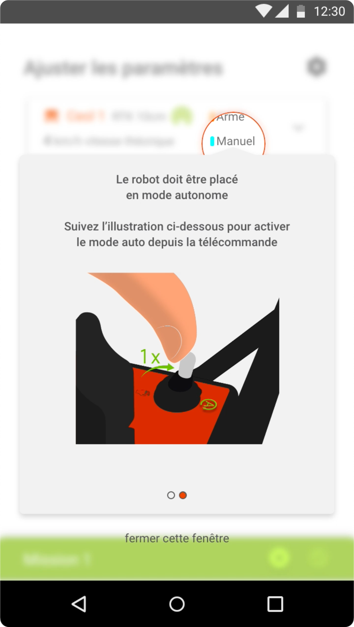
reminder to use "auto" switch on the remote controller, to set machine on "auto" status in order to release the robot
"I didn't expect it to be so easy to use."

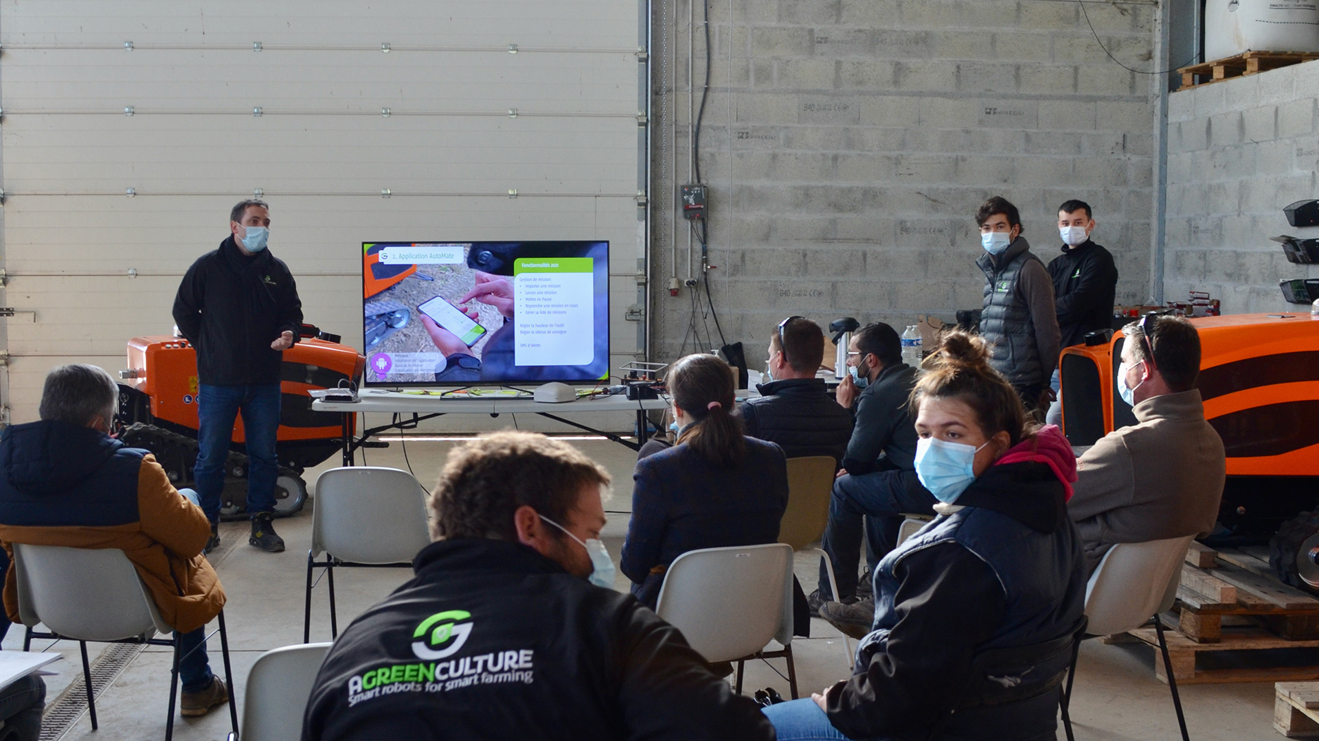
presentation of the application design and user path to future users © Agreenculture

Once we had a MVP (minimum valuable product) we met with prospects and potential users : they know what happens on the field, and what they are expecting from a robot.
During tests sessions or demonstrations with end users, we put the mobile application in their hands. The ecosystem is not fully functional yet, it has only few features, but they give us a lot of feedbacks. They also express their feelings about how robotics will impact their work, and therefore, their life.
The specificity of robotics or any interactive product is that the entire system has to work, prior we can go testing a feature. Otherwise users won't be able to live the new experience we propose.
🏆 My satisfaction at this stage is to listen to feedbacks saying "I didn't expect it to be so easy to use."

sequence filmed by drone during a demonstration ©Agreenculture

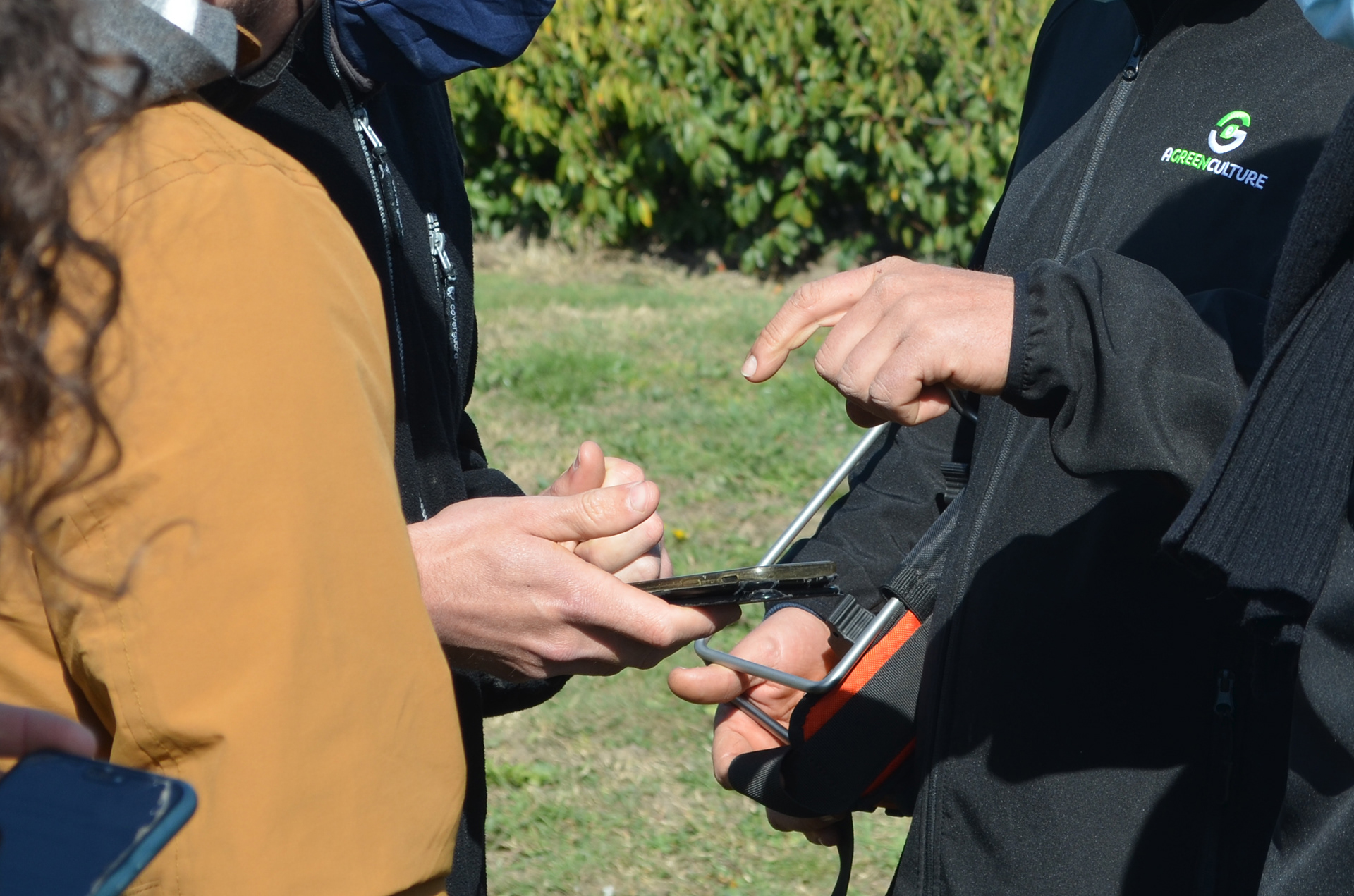
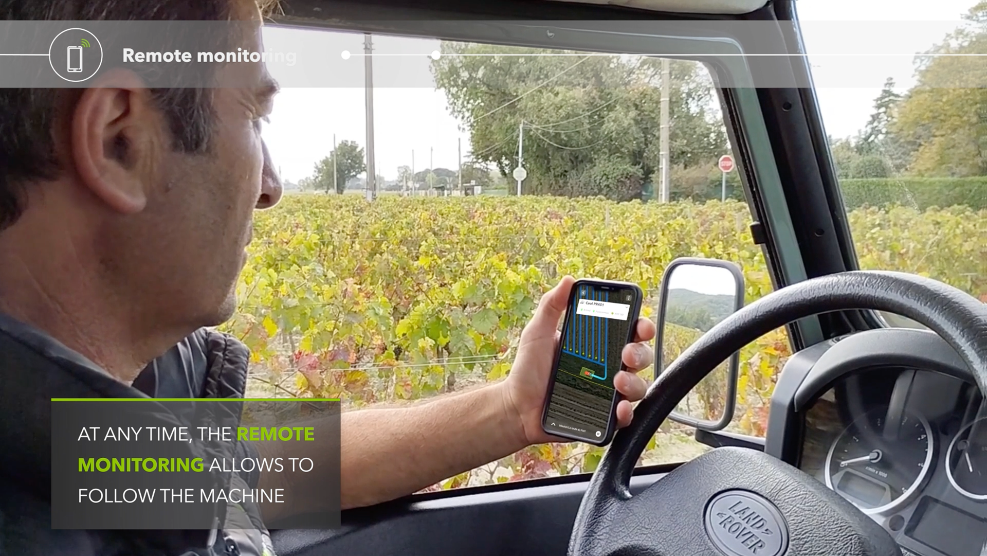
During testings sessions or demonstrations with final users, we put the mobile application in their hands. © Agreenculture

Video of actual product in 2021 — extract from FIRA 2021 Demonstration movie © Agreenculture

Work in progress
We are working on multi robot management, agrointelligence and reinforce ergonomics
stay tuned…
Contact
Submit
Thank you!
Back to Top