Agreenculture's robot prototype is a demonstrator of company's technologies and know-how capabilities. To promote in-house skills of mechanical engineering, embedded navigation systems, signal treatment, software development, and in order to facilitate dialogs with end users, Agreenculture had to invest in a visual identity.
CEOL's aesthetic expresses the synthesized skills of an entire team dedicated to its success. It's a uniform package that combines technology and tradition, disruption and harmony.
Simple lines to set a momentum, and intent, as it is only the first of its kind. It is the design of Research & Development platform.
Industrial Design
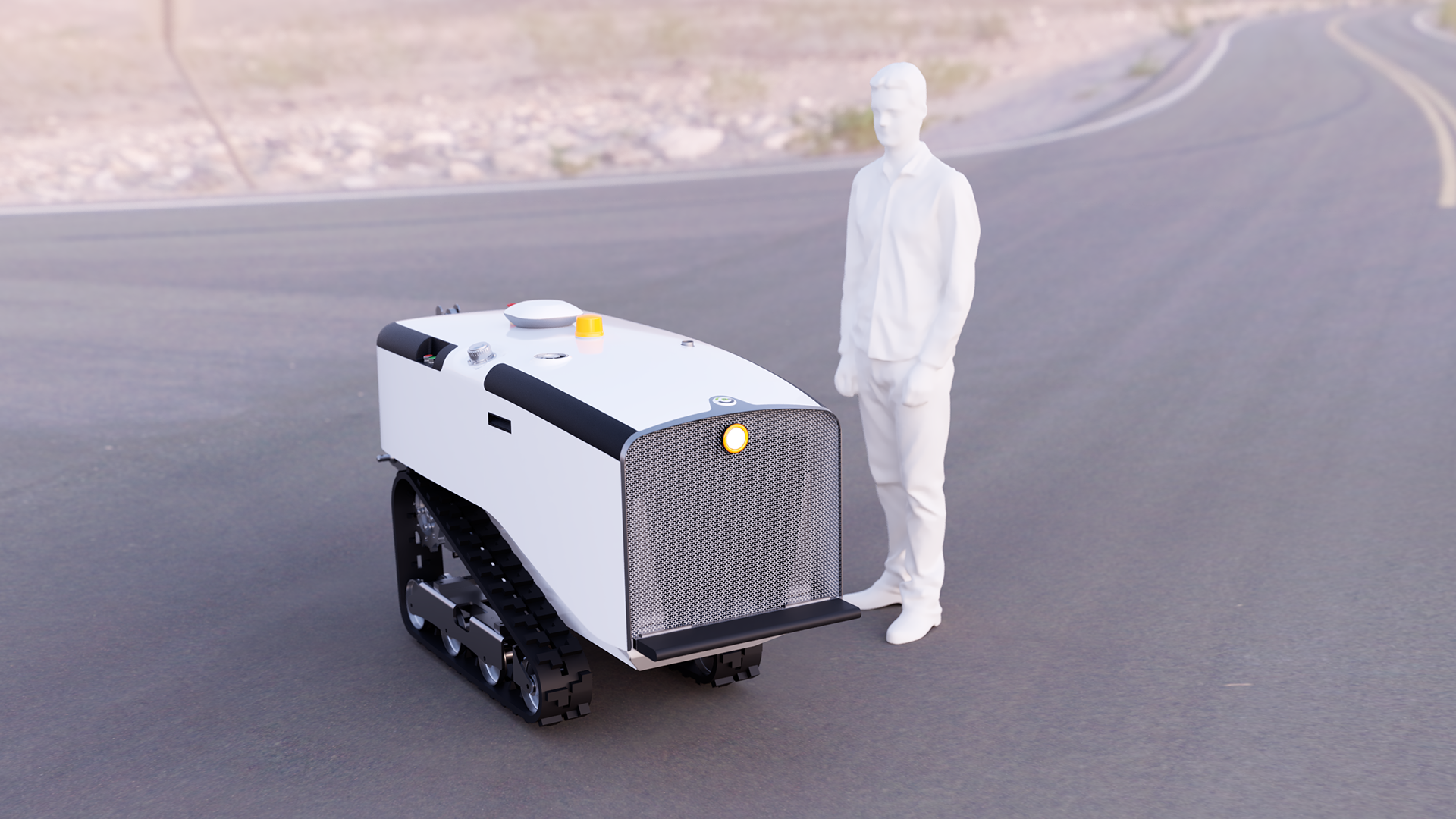
CEOL is the actual demonstrator dedicated to viticulture, arboriculture and market gardening.
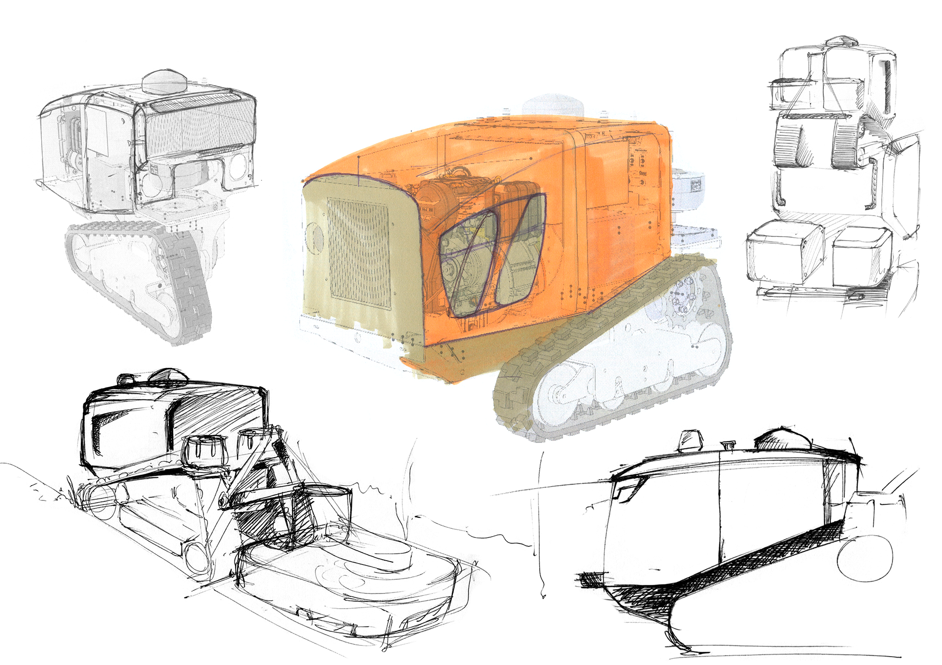
When I began my collaboration within Agreenculture, CEOL had a prototype look.
CEOL's version at my arrival
My mission is to let CEOL speaks through the design, to tell its simplicity, self-confidence and endurance. He tells a story of tradition and know-how meeting innovation and extreme precision. A story of a full dedicated team working to tackle big problems with eco & logical solutions.
We started looking for symbols and aesthetics to express Agreenculture's values :Bravery, Reliability and Heritage
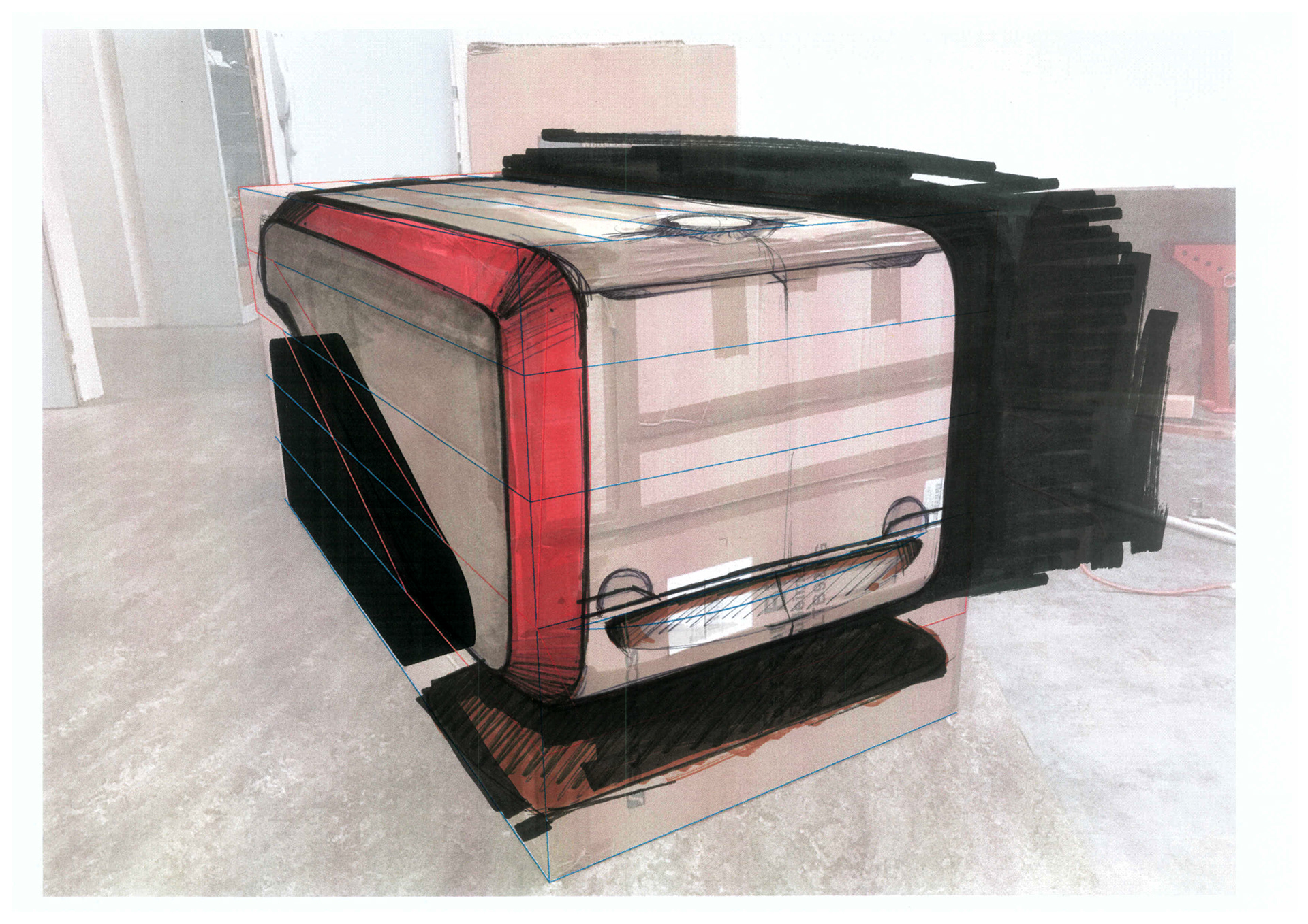
Early stage visuals


Based on the existing frame, I quickly made this concept which wasn't for production but express how to promote Agreenculture's values.
To me, in order to meet the market (robots are not yet deployed) and inspire confidence in users, the recipe is simple : we must be humble yet slick. But…
- What codes can define elegance for an agricultural robot ?
- Where or When can we look for it ?
- How to remain in the mainstream agriculture aesthetic codes while evoking something completely new and make it look at least homogeneous ?
One of CEOL's aspects is "Affordable" : Agreenculture wants to deploy a democratic solution.
For the design, it means a product that you feel close to. A product you can easily read and understand without even thinking about it. You feel familiar with it.
Another aspect of CEOL is the convergence of what - in normal circumstances - could be seen as contradictions.
For example, a very high-tech autonomous solution in a culture of handiwork.
In a way CEOL is the "iPhone" of the agricultural robotics. This is not disruptive, as high precision and automation have been present in agriculture for years. But it happens at a moment where potential users and technology are mature. It's a step in technology evolution. What's new with CEOL is the replacement of the emotional image of the farmer on his tractor.
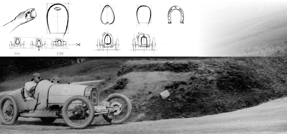
© Bugatti - I was inspired by the T35, which made a big impression on me as a child, and for me represents the raw synthesis of engineering and design. Bugatti's high standards are evident at every level, and the company has maintained a strong, simple symbol over the years.
The last time in history of technical innovations we had this convergence of contradictions and yet opportunities, marking the beginning of a complete new era, was the iPhone of course. Joke aside, where handiwork culture meets high precision, close enough to a mobile self-supporting structure, is in the car industry, especially car racing.
The race cars of late 1920s really inspired me for CEOL as they represent the commitment of an entire team offering the equivalent of high precision and excellence for both manual work and technology.
This is "When" I find the trick which will become the backbone of CEOL's design to orchestrate values, starting with Bravery, Reliability and Heritage.
Of course, race cars weren't an inspiration about target price…
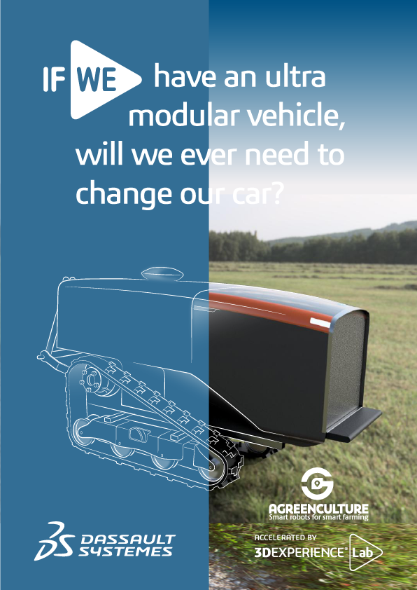
Early stage visual used in Dassault 3D Experience Lab Campaign - link to Agreenculture's page
Anthropomorphism awareness sketches
As an introduction to Industrial Design inside Agreenculture, I started with a small contest to familiarize employees with anthropomorphism. I wanted to allow them to express their feelings regarding shapes and proportions, especially in prediction of light integration.

The new frame
Real-time sketching during sessions with mechanical engineers team
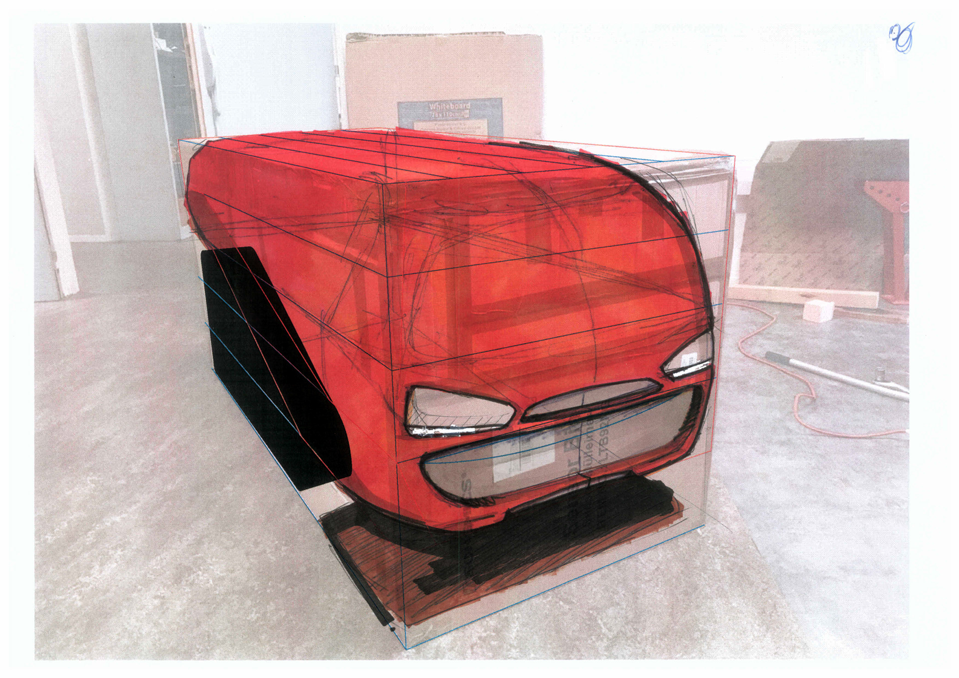
With the backbone defined, I orchestrate other aesthetics codes as the mechanical and electrical developments evolve.
The 1920s race cars stick to what is strictly necessary. Every single part has a function and its integration respects two principles in order to make it both usable (visible, following the concept of affordance) and characteristic (through color, symmetric or asymmetric geometry, creating a visual pattern or a uniqueness, etc)
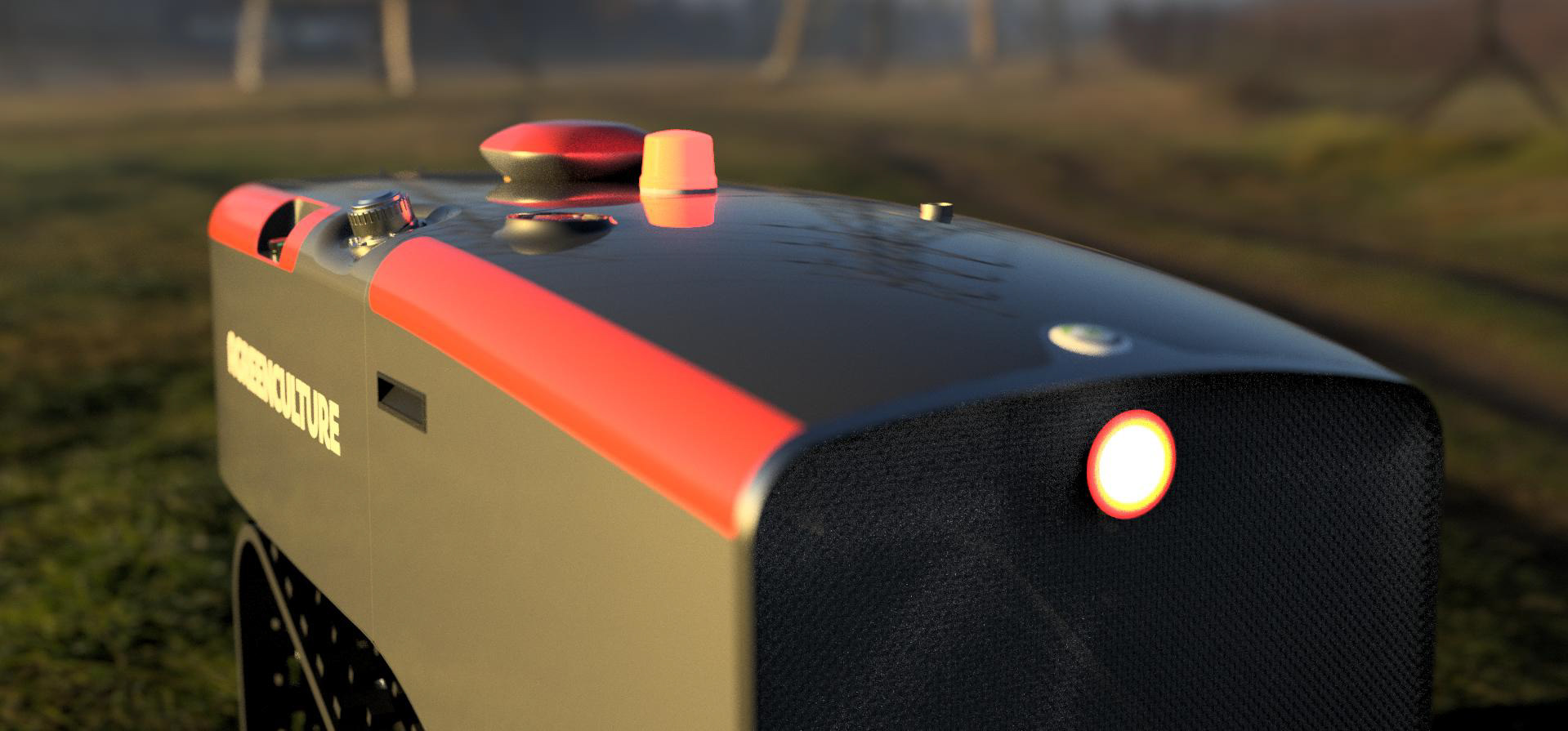
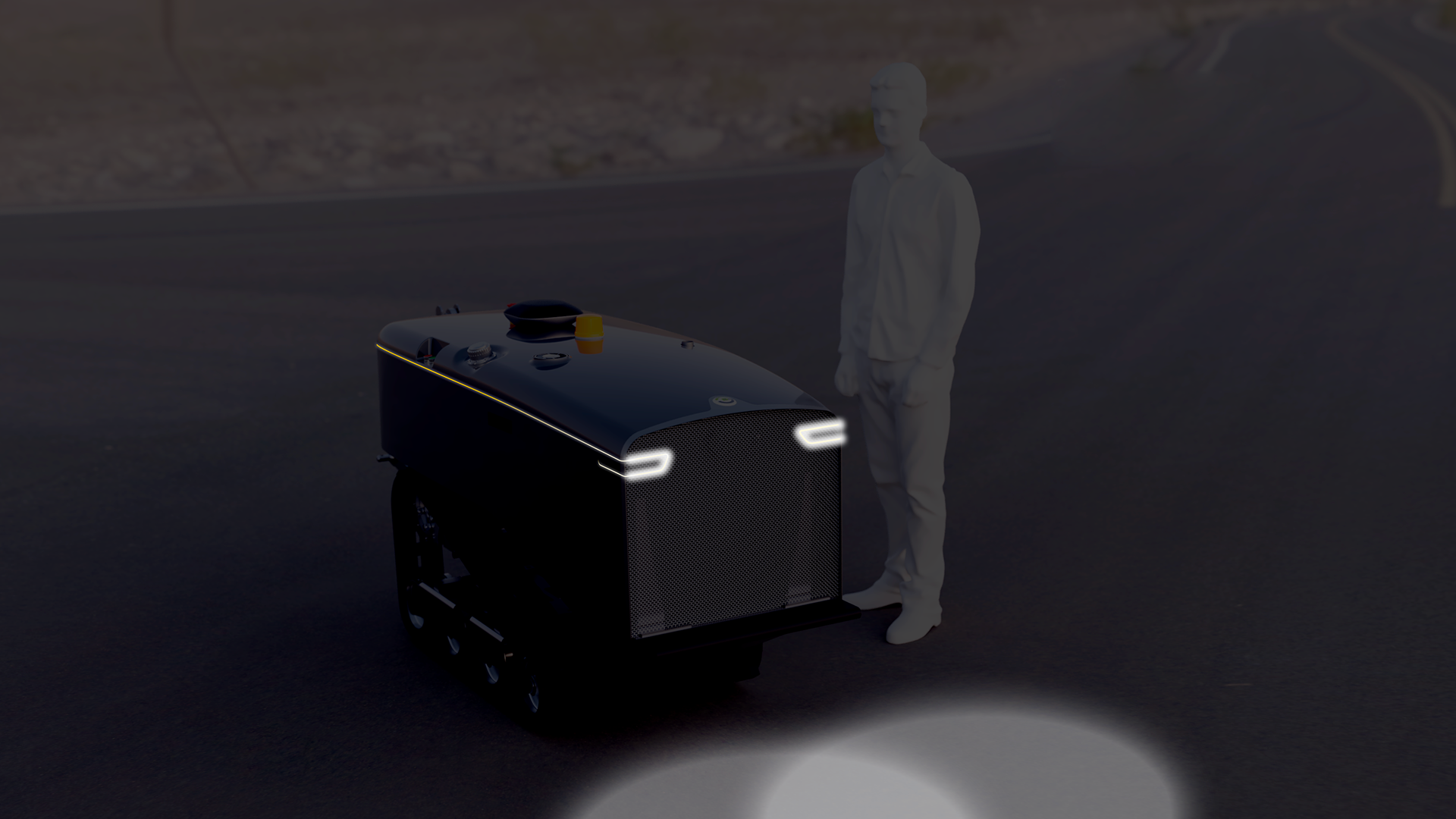
I reproduce this principle on CEOL as it is a professional machine. Actuators, informations and feedbacks (light, signal, etc) must be easily found and understood.
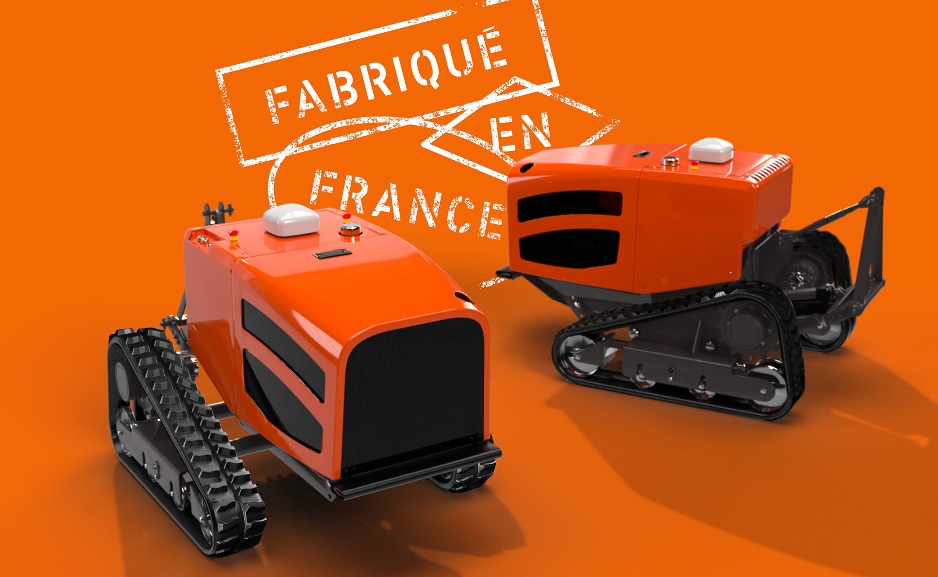
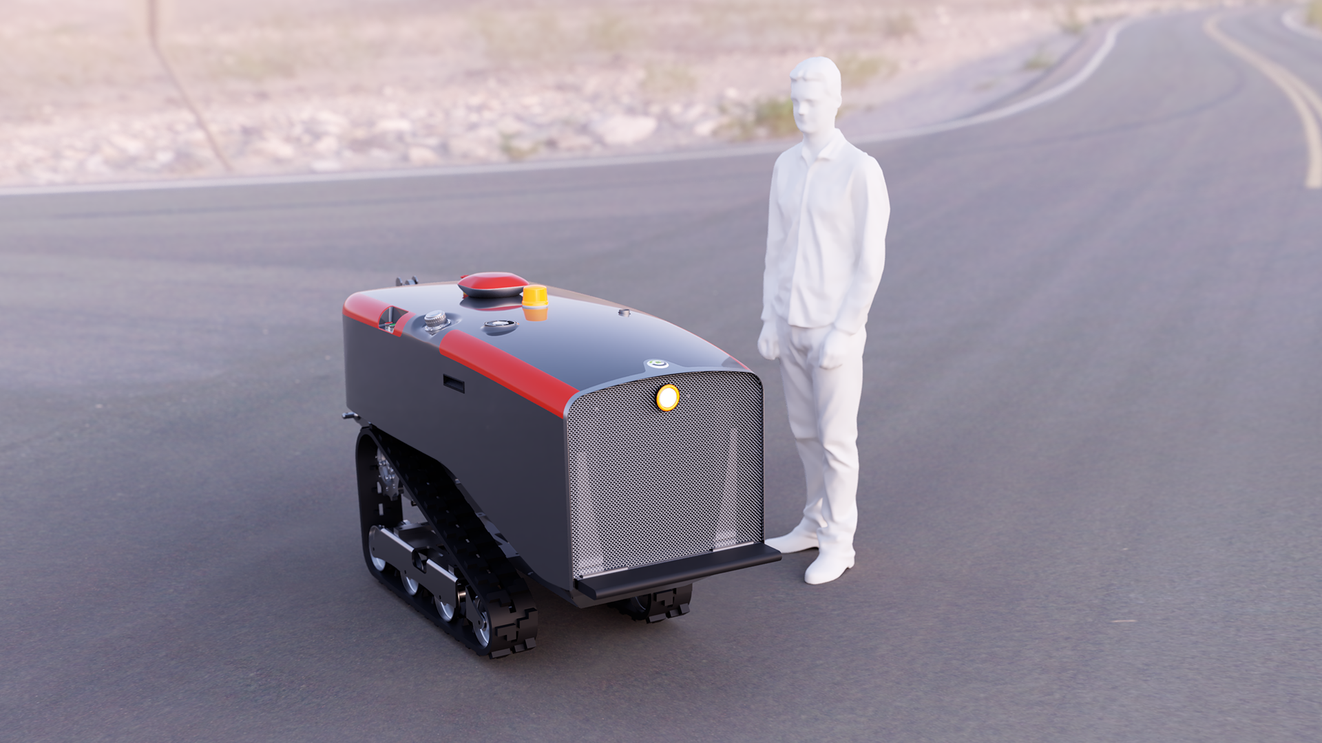
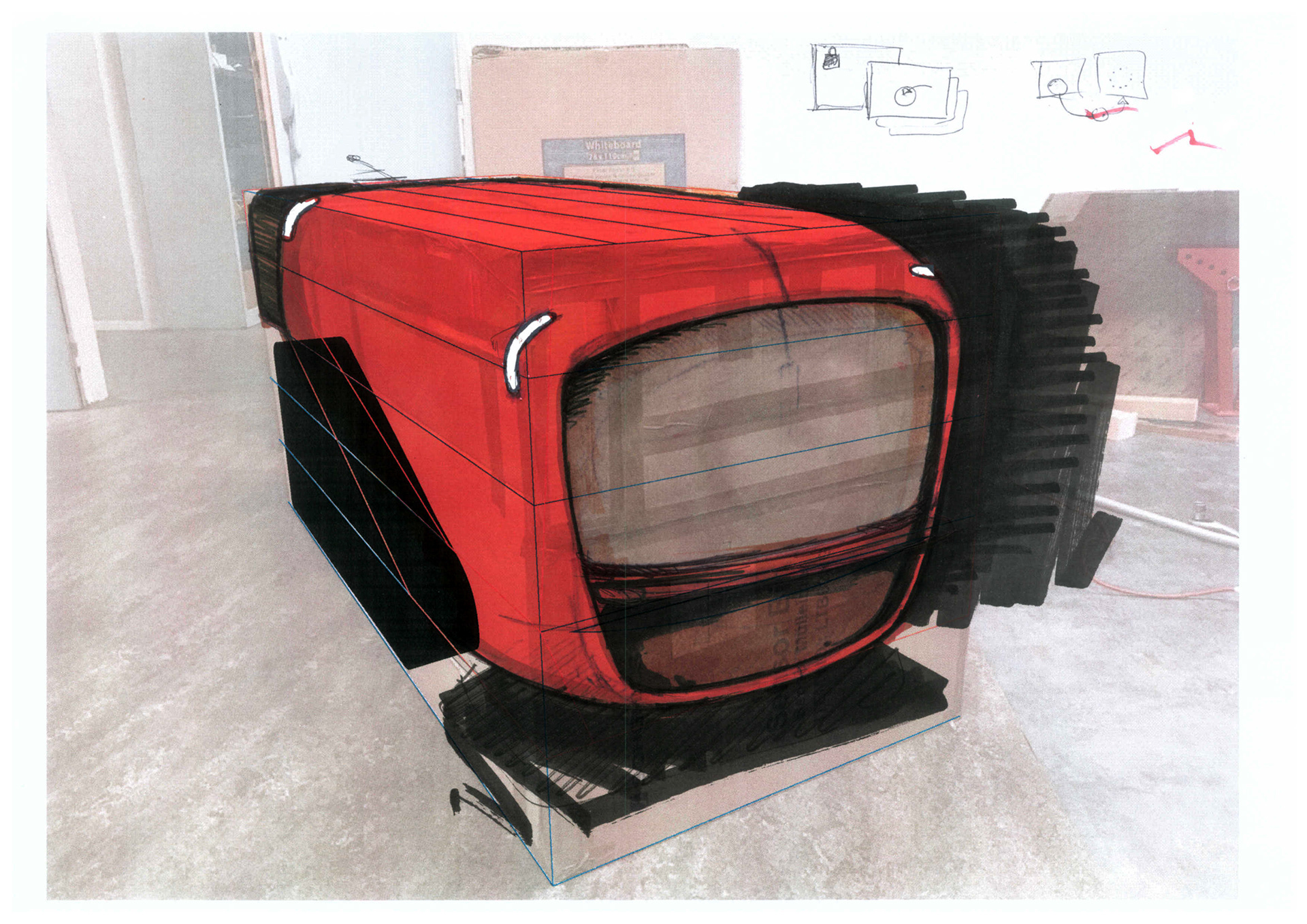
CEOL is orange, so it is easy to distinguish it among the vegetation.

But orange has another meaning. Agreenculture's founder wanted to revive memories of the French tractors of the past, when Renault produced tractors in France.
Although deeply European thanks to its partnerships, the company wishes to celebrate its French origin through a very useful color on the ergonomic level.
Ergonomics also consists in organizing the user interactions poles on the robot which then becomes more a dashboard.
This is how I try to answer the question "How to remain in the mainstream agriculture aesthetic codes while evoking something completely new and make it look at least homogeneous ?"
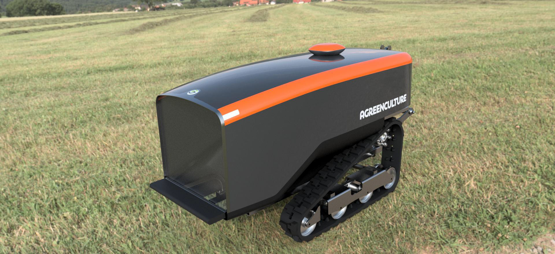
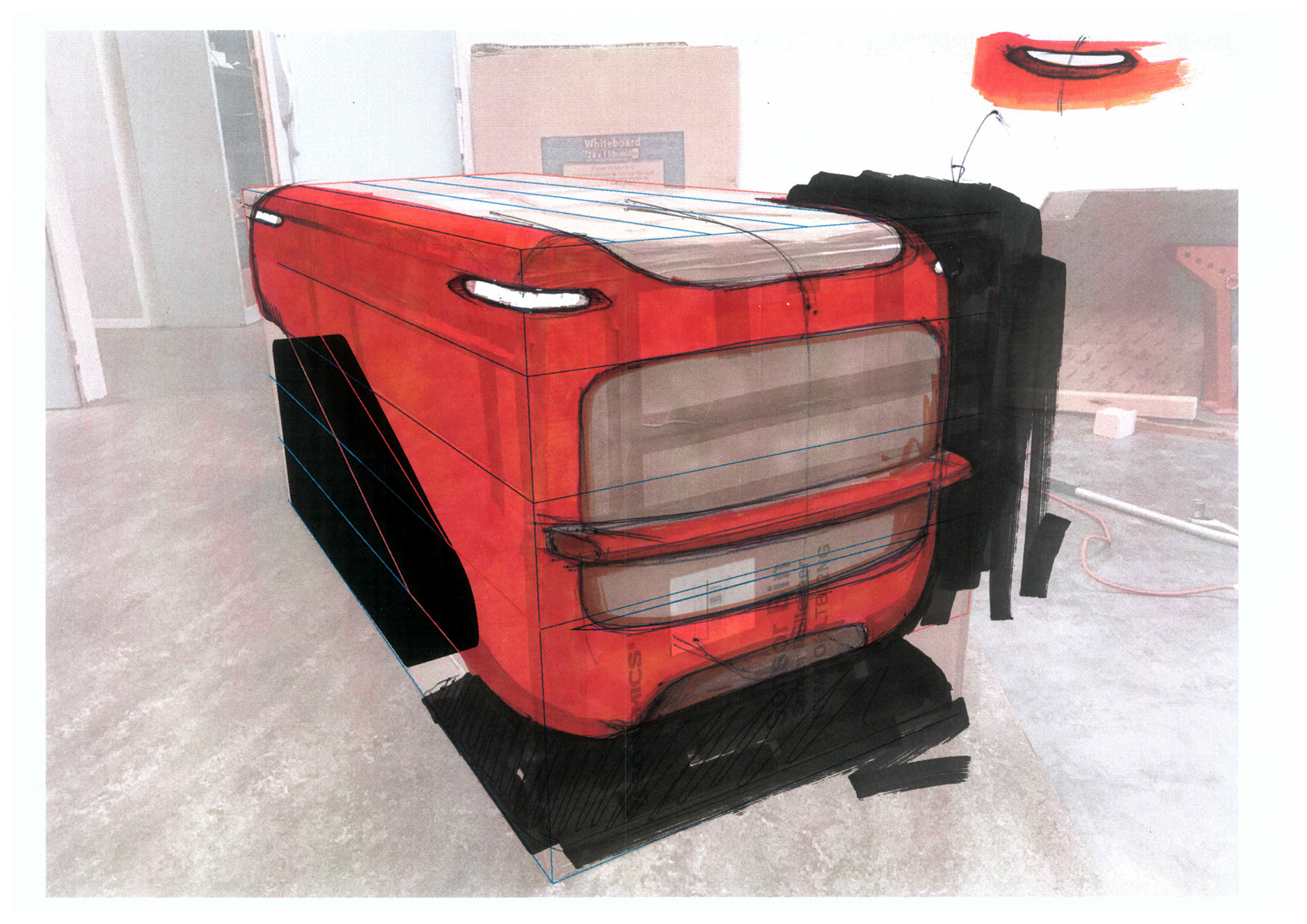
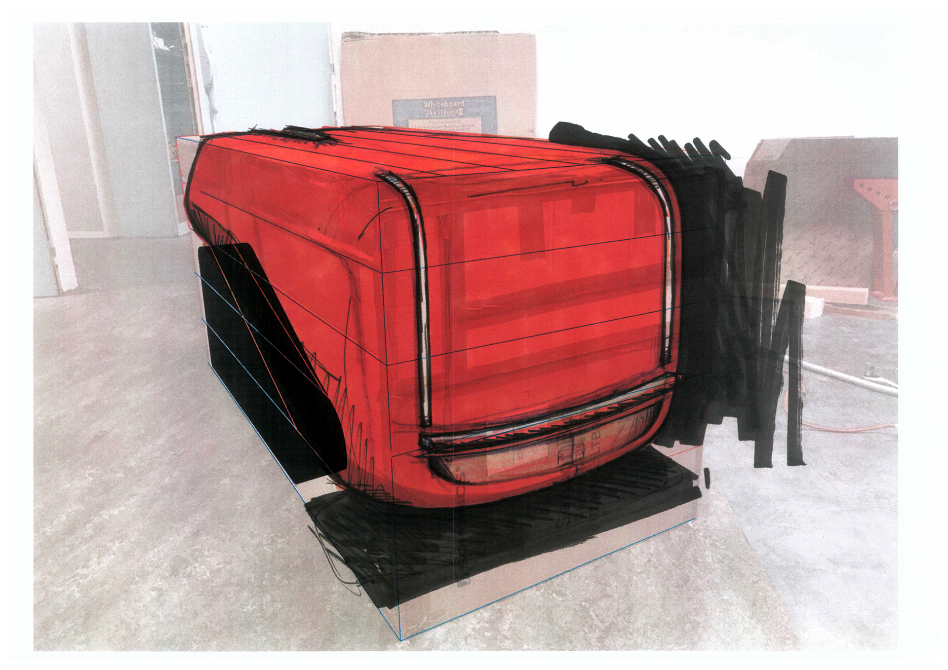
- Time & Line : CEOL is a step in the history of agriculture and technical evolution. It is a milestone in a large timeline.
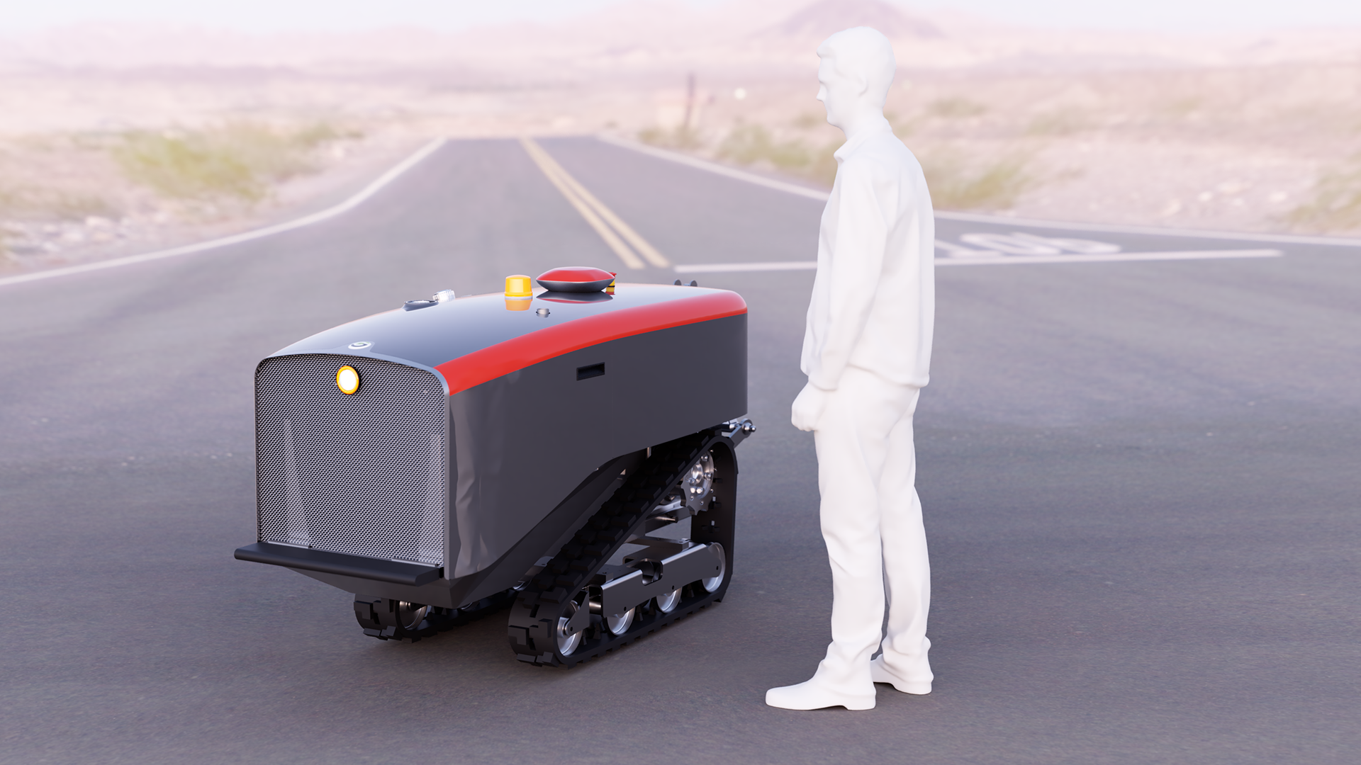
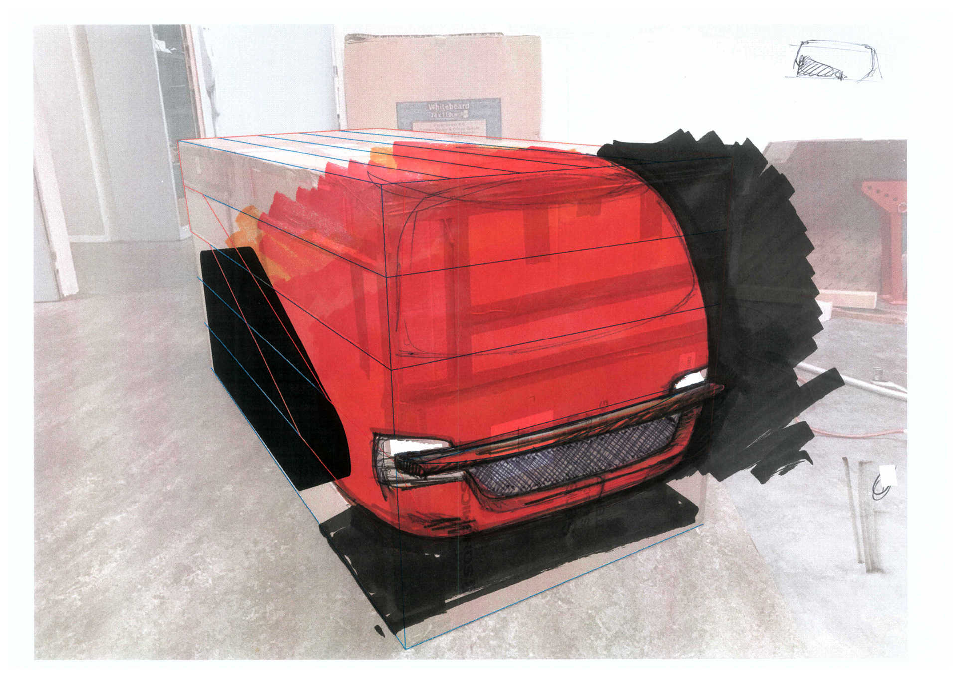
- Agriculture aesthetic mainstream code : the "steep-nose" hood design
- Matching contradictions to highlight opportunities : I split design in two areas. The Square will represent the industrial aspect of CEOL, the power, the efficiency, the precision. It sits where the cabin used to sit. The roundness, at the front, represents the Tradition and Heritage CEOL is made from, and also the familiarity and the stamina.
- Being humble to meet the market : CEOL's design is made of only one strong characteristic, one line. Fading from the square area at the back, to the front, where this familiar link resides. This line guides the eye from the back to the front and vice-versa, like a pendulum movement, linking both aspects of Agreenculture's know-how.

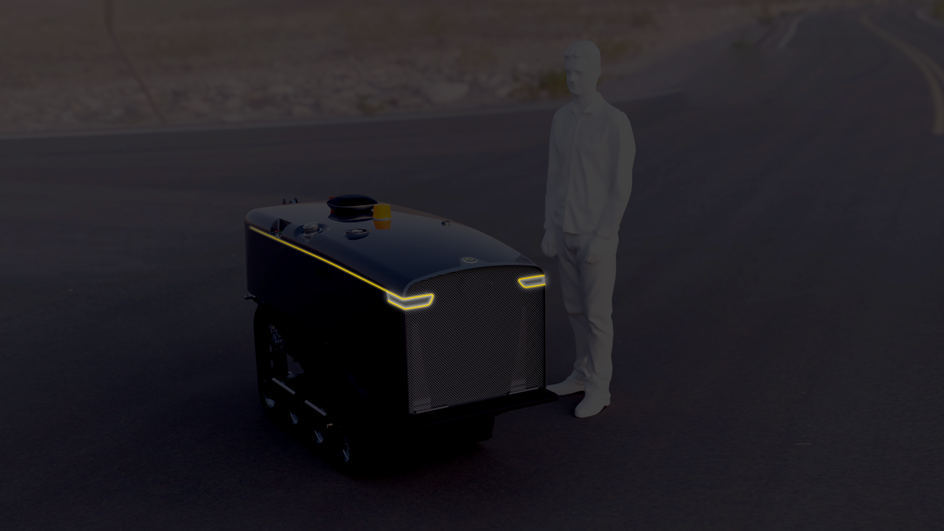
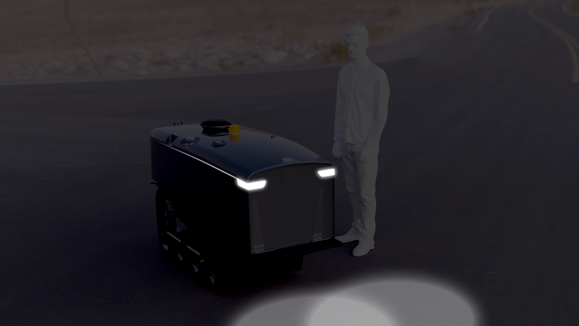
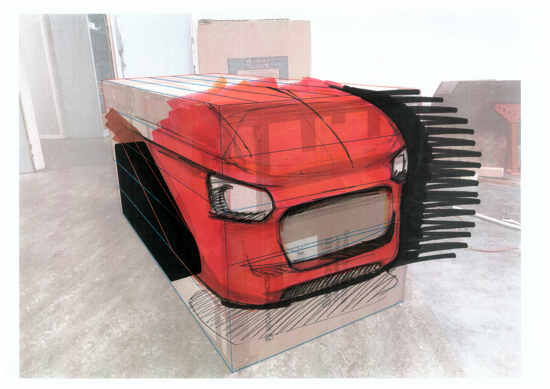
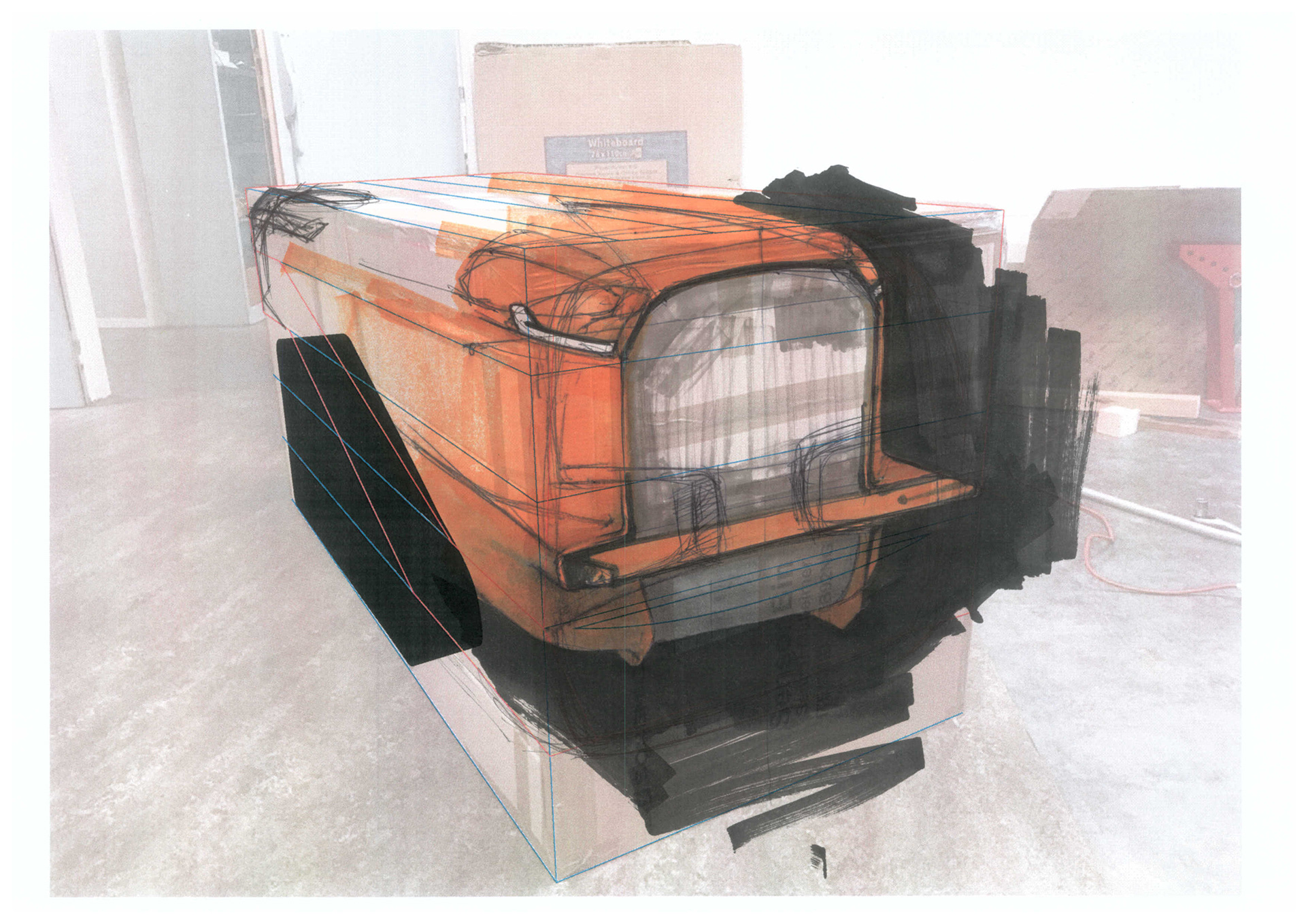
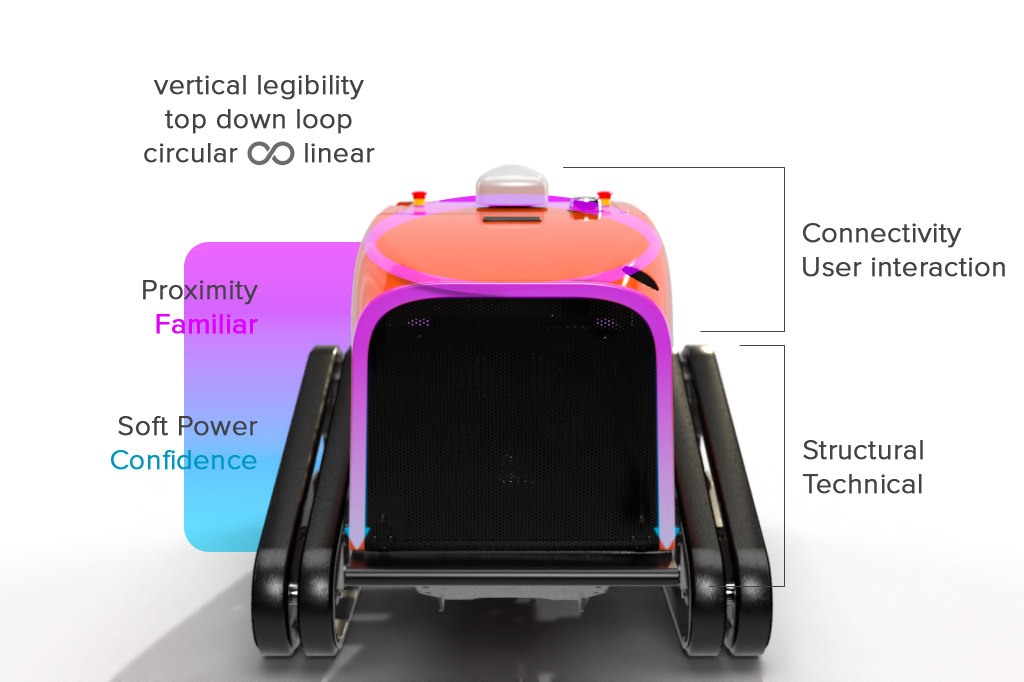
The front view of CEOL prefigures what later will express its "face".
Here, the vertical legibility links proximity and connectivity with self-confidence and structural aspects, so user can feel close and reassured by a machine to which he/she will entrust his/her assets in complete autonomy.
🏆 My success in this project was the takeover of CEOL by a leader in the wine industry, Pellenc, who was won over by the concept.
The design will of course evolve to integrate their product range and brand identity.
The design will of course evolve to integrate their product range and brand identity.
My role as industrial designer on this project worked, since the aesthetics of CEOL, as a demonstrator to approach a still undefined market at that time, contributed to the success of Agreenculture, which was able to demonstrate a high level of standards for a startup of this size, and thus convince both end-users and industrial partners.
Contact
Thank you!